Phone
+61 478 265 294
Address
, ,
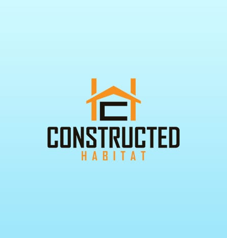
Constructed habitat is one of the businesses. That was looking for a logo preparation and they were starting off the business was dealing with the construction of houses and giving them an aspect of the interior with an interior design structure and making sure that the consumers are getting the best use out of them. They were detected as and they wanted to have a simple minimalist logo and make it as per the demands of the client that the logo could be featured in The Brand. Constructed habitat. They were also having different ideas. They were not used to the basic colors in they wanted to have a very simple and materialistic logo

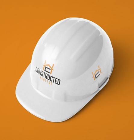
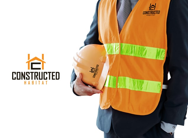
To get the best version of the logo for our clients. We had to look for similar businesses that are operating and how they have constructed their logos. And how many folds the competitors have been for them. For this purpose. We sorted out the regions and we sorted out some competitors that were having you and very well established logos, and we try to overcome them and develop a brand new logo for our client
as recommended by our client, the age group, were people from 30 to 40 years of age. These are the people who are in their midlife and they are the homeowners, who have the visions of creating houses or getting their interior designing done. So they were the users who would be our targeted audience and we had to make sure that our logo is implying valuable and impactful, listen to the message of the business, and making The business valuable for our client.


The logo design was initially an ide generattion for our client, they ware an interior designing firm which was moving toward a developmental aspect of interior designing. we moved with simple palates since the oil palleting versions were not recommended by our client, same was the scenario when we were having a competitor overview for our client and ensuring that e have the best version for the client. The name was the key message and the client persona was kept in mind while developing the business's services and enhancing the brand meaning simply with creating and attraction without logo. The plates were used in shaded which imply the development of business and the aspect of construction and homeownership was developed.