Phone
+61 478 265 294
Address
, ,


This specific logo was for an organization that is more into the fruit market and close to nature. They are very Professionals in the fruit industry, and they wanted to enhance their business because of the presence of and modified logo. The basic Services, which the business provides will, the production of foods. Including blueberries, cherries grapes, and hazelnuts, Etc. And these were used and performed by several data analyses and interpretations of multi-layers of data. They are using the technology to enhance their business and making sure that they are getting very profitable business deals. When we move into the business, allegations. We have seen that. They also were having a really good and well-developed business structure for themselves
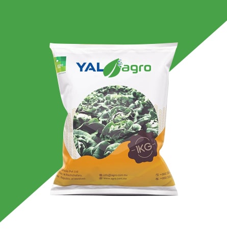
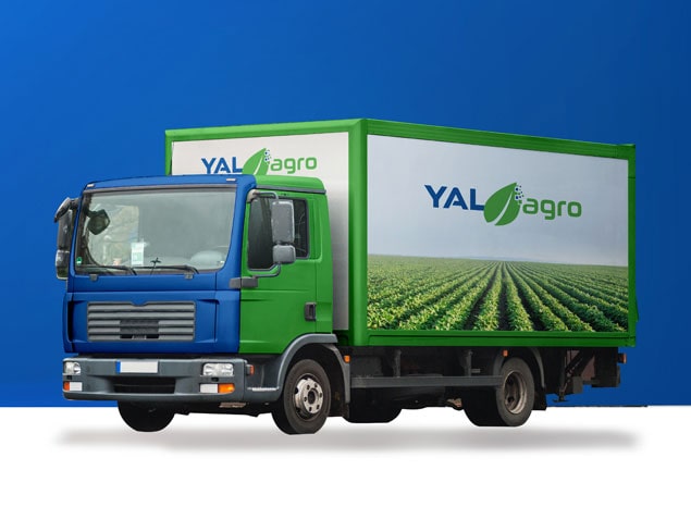
Since this business was related to the development of technology and integration of the technological base data to World The Greenery and the plantation, since the business was about the fruits and they were using technology and data integration for uplifting their business. We make sure that the logo was perfectly liberating, the business terms and conditions of how this process was operating, the business logo should be having all Aspects, which were to make sure under the designing team. Furthermore. This was a challenging yet, the exciting task for all of us and we did it with perfection while executing a competitor analysis for them
The user Persona was all the people that are directly or indirectly associated with the business of fruits and vegetation. Furthermore. This was a new Venture that was using technology for better implementation and for fostering of the props and this was kind of a new Venture and there were no such competitors that were working currently. So we had to enhance the working cultures and we make sure that the new mode of working has been implied and exemplified in a very exemplary manner. The age group could be anyone ranging from the mid-20s to late 60s because this is a business venture. And this was designed specifically for business owners and business professionals.


This was an exciting task as the technological world is moving and everything is getting modernized, the use of technology and forecasting for the crops is just as exciting and attractive as any other business venture. We did extensive competitor research and analysis and developed a rationalized view of how the processes are working. and as soon as we got a proper overview of how things are working for the competitors we got on and developed the best and result oriented technology and nature integrated logo. The client wanted the logo to be based on three colours BLUE, GREEN and GRAY respectively. We performed the logo design and developed mockups to enhance and exemplify the work as this was being done. The outcome was downright impacting and gave the impression of developing the brand reputation in an impactful way.