


Phone
+61 478 265 294
Address
, ,

This was our old client and we developed a new logo for them, they required some modifications for removing some text from the logo and wanted to have an alternative color adjustment as well. We had quite an insight into the business and we were working previously for them as well. So this was not much of a hectic task as we already had done our research and helped them yield goals for the next task. so we got to work and got this done in a comparitively shorter period
This was a redo of a previous task we did so there was no new research we resorted to looking at how we helped out the client in the first place and used the available date to get things done. However, we did check the trends and the preferences of choices which was probably something based on trends. So we resorted to revisiting and reconfirming our research for the client
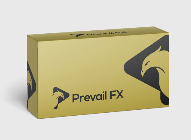
as the business was based on the trading and using the forex resources to the best extent it wasan excellently chance that we could use them to develop and work on them based the ages of youngsters and going far too old and adult people who could use trading forex and using similar trading activities to improve their living.

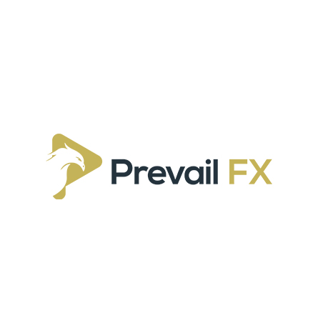
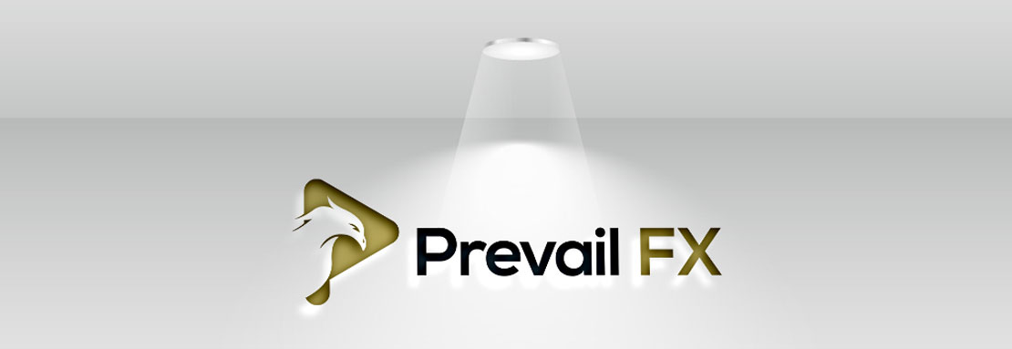
All the client wanted was to have the wording removed from the pre-existing logo and the only wanted to have the Prevail FX to be maintained, and that the logo was very simple and it has an eagle sign over there, which was implying the eyesight of an eagle who is very aware of his surroundings since the effects and the similar markets are developed on the idea that you have to look forward to seeing the future for past. It was an excellent opportunity for us to make the logo. Oh in the way possible. The color schemes used words, blue and golden, which were identified by the client and the white background was simplifying and enhancing the logo creation in short. It was a redo of the logo. We have already created. So there were no new things involved. Only the.com was to be removed in the previous logo, and the logo was remaining the same
+61 478 265 294
, ,
© 2026 Zelicade PVT LTD | All Rights Reserved.
© 2026 Zelicade PVT LTD [PV 00252144]
All Rights Reserved.