Phone
+61 478 265 294
Address
, ,
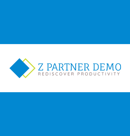
The business was regarding the barcode and mobile Computing Solutions. Along with the RFID problems that users face. They wanted to have a logo, that would be consisting of the brand name their tagline, and the computer that would be having on the open side. It was a very tasking and challenging task. Because the company was just taking off, and they wanted to have a solution for the logo design, so that it could enhance them working criteria for the long run for More than hard, a very specific Criterion that was provided to us, which was to be followed strictly for the maximum benefits
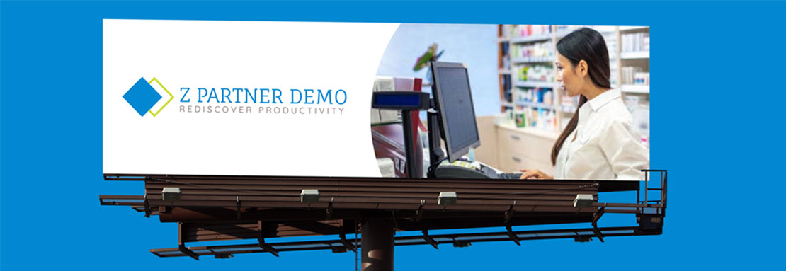
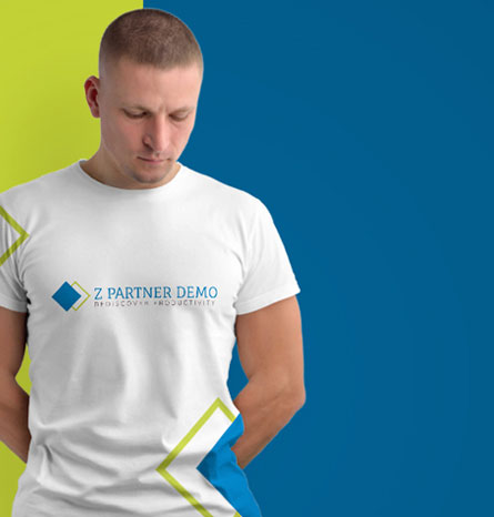
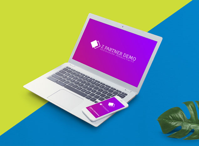
We looked into the website. We saw how the business is running and what are the possible competitors? That could be a threat to the business and what are the existing brand names that are working on a similar business model, and yielding, beneficial results. After the initial research, shortlisted some competitors, and observe their logo and we saw how their logo was imparting the message of the brand and Company. So we did our initial research be sought consolidation from the client regularly. And finally, we got a tech-based final logo for our client
The users were the people and large scale or the small detail scale manufacturing industries of working organizations that are requiring their solutions for the internet-based or the RFID problems. This was done in a way that it could help them and better working right area for them. So, the age group was not very specified. It was mostly the business organization and the business companies that are requiring assistance related to business solutions.


The client wants a simple logo that is a square box rotated 90 degrees to left with a line draw from top right to bottom right of and they wanted to have a tagline to say Z PARTNER DEMO With a tag line under the logo saying Rediscover Productivity the use of dark blue for the box and the light green for the line was maintained and logo was kept to be capable of being used on two background, one light (white background) and one dark (black background)The logo text should be Z Partner Demo Google Fonts Headlines: Fauna One Copy: Quicksand were used as per the client's requirements Following colors were suggested Headlines: (dark-ish blue) #0288D1, Green (accents): #CDDC39, Lt. Blue: 03A9F4 this was a detailed and thorough tas which required assistance and enhancing of the business in a more effective manner